

Forgotten Memories ~ Digital Painting ~ 8.5 x 7.69 Inches

Acid Nights ~ Digital Illustration ~ 16.64 x 11.69 Inches
Tail Light Nights ~ Digital Illustration ~ 16.54 x 11.69 Inches

Spooky Nights ~ Digital Illustration ~ 11.69 x 16.54 Inches
Mushroom Spirals ~ Digital Abstract Artwork ~ 16.5 x 11.7 inches
Oceans Flow ~ Digital Movement Study ~ 6 x 6 Inches
Lyrical Diary ~ Digital Album Cover Design ~ 11 x 11 Inches
Shattered Master Piece ~ Digital Album Cover Design ~ 11 x 11 Inches
Low-Go ~ Logo Design ~ 5 x 5 Inches
Design Logo ~ Logo Design ~ 5 x 5 Inches
Puzzle of Life ~ Digital Illustration ~ 15.52 x 15.52 Inches
Flubber Friends ~ Digital Illustration ~ 6.41 Inches x 2.69 Inches
Rut-Roh ~ Digital Illustration ~ 8.5 x 4.65 Inches
Shenanigans ~ Digital Illustration ~ 11 x 8.5 Inches
Loving Comfort ~ Digital Illustration ~ 11 x 8 Inches
Harmony ~ Digital Illustration ~ 11 x 8 Inches

Lolli Meadows ~ Digital Illustration ~ 7.67 x 10 Inches
Celestial Lights ~ Digital Illustration ~ 20 x 16 Inches
Halloween Fun ~ Digital Illustration ~ 792 × 576 Pixels
Life's Joke ~ Digital Conceptual Illustration ~ 6 x 6 Inches
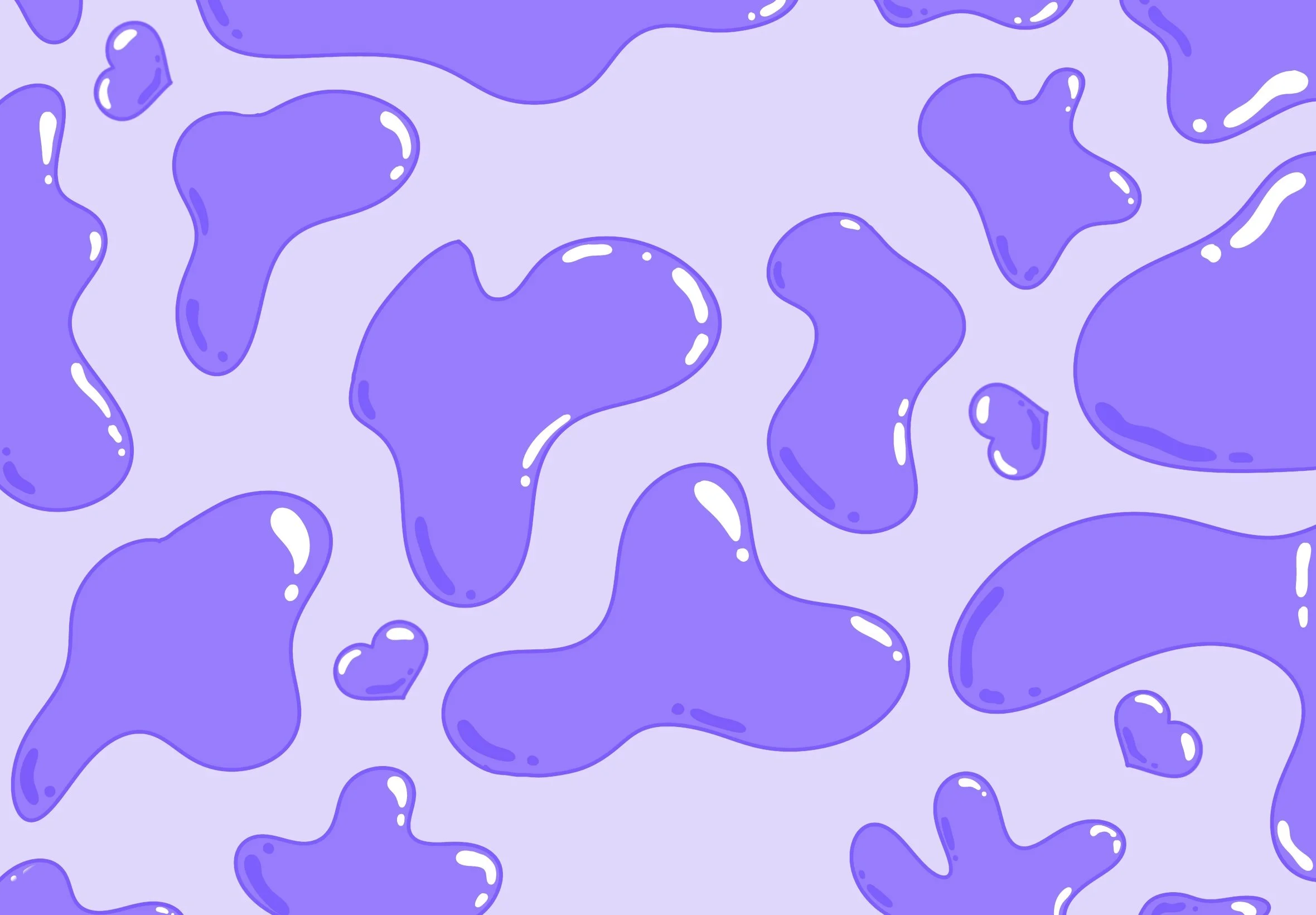
Lavender Lava ~ Digital Illustration ~ 2360 x 1640 Pixels
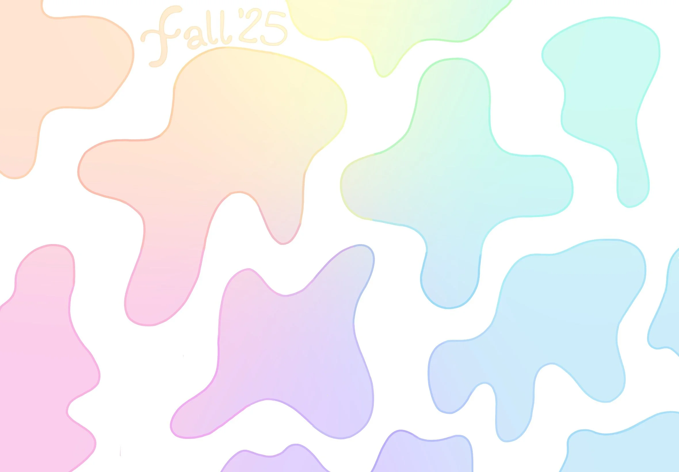
Pastel Puddles ~ Digital Illustration ~ 2360 x 1640 Pixels
If you would like to know more about the artwork above, read more here!
-
This is a digital still life I did summer 2025. I initially chose these objects for the interesting shadows, they cast. As I continued working and experimenting with desaturated colors, the piece began to feel like when you’re thinking about your childhood and you remember it so fondly but its fading as all memories eventually do. I tried to embody that feeling as I finished this piece. Leaving it with a whisper of sadness.
-
The prompt for this was a collage environment that represented either a dream or a nightmare. I was thinking the fair, like as a child, is a dream but then I got to thinking my childhood was a bit of a nightmare so I wanted to throw all these good things together and make it “too much” I think this shows fun but makes you feel a little bit weary.
-
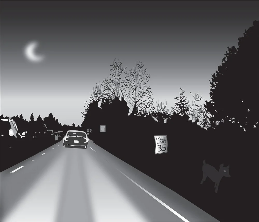
For this illustration, I used a photo I had taken of a sunset and recreated it, adding a couple elements including the speed limit sign and the headlights to add depth to the photo, the moon and the deer to add an ominous vibe. I love making people feel emotions and spark imagination within them and this was a different feeling I was trying to convey than normal, but it became one of my favorites.
-
In my Graphic Design class I was asked to make a poster for an event of my choice, also completely out of typography. I kept this poster in black and white other than the red elements so the creep factor would follow throughout. I used a bold font for the important information and drippy font in red to represent blood for the rest. The cars are made of a movie script to add more authenticity as well.
-
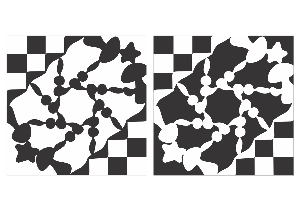
This design was made from an assignment learning ambiguous space. I was shown Tessellations and really loved that idea, I also tend to lean towards symmetry so using random shapes I created this. Im not sure I hit the mark of ambiguous space in a traditional sense, but I really like this design in the end.
-
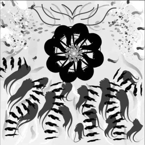
To learn more about movement I did this assignment, using different strokes, widths, values, and overlapping. I created a focal point and used different tools to have many marks moving towards it. In the end to me, it feels like an underwater scene with schools of fish in the background as well as in the foreground swimming towards something.
-
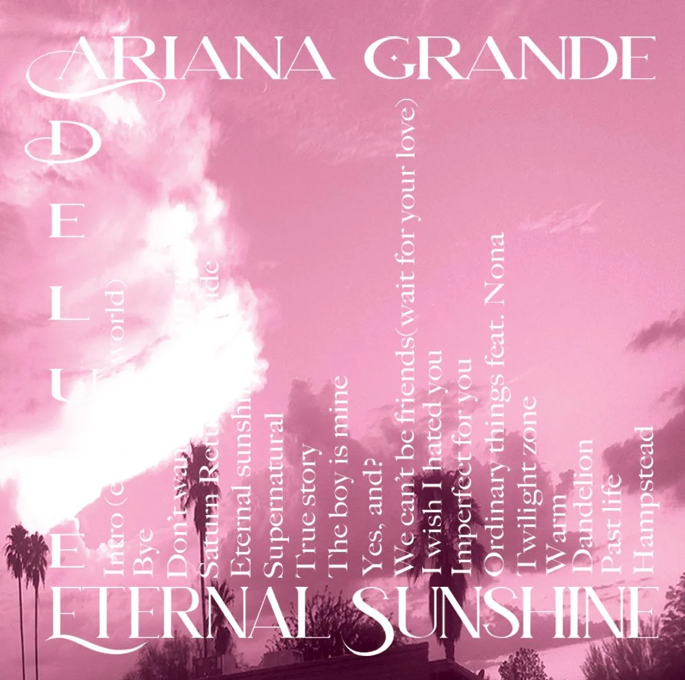
This album cover was created for Ariana Grande’s new album. I wanted to embody her fun and poppy personality while also making it dynamic. Since we usually only see album covers on our screen now I wanted to give it a way to be interactive, people at the very least have to turn their phone to view the songs. I used an image I took in Arizona and overlayed it with a monochromatic scheme to show the album's repeated theme throughout all of the songs, she's all she needs just herself.
-
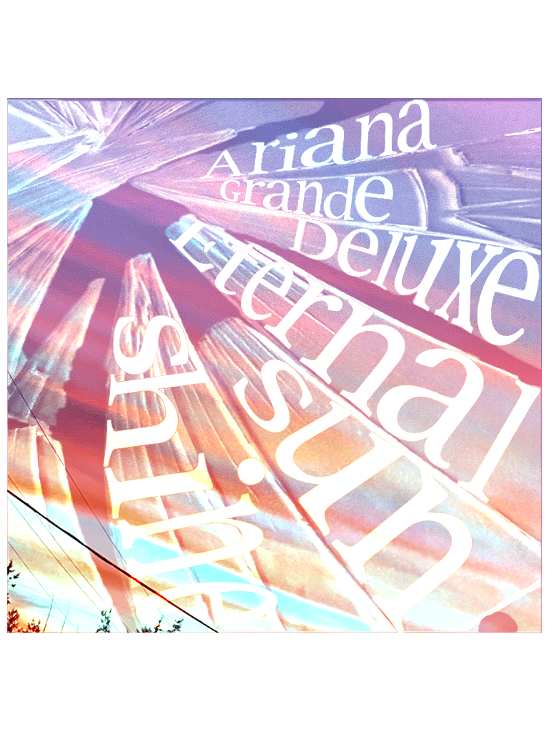
This is another album cover I created for the same album. This image is also from Arizona of the sunset I had taken. I then got a picture frame and broke the glass and took a picture of it. Using photoshop I added the glass on top of the image. I then decided once again to add a dynamic value to arrange the information within the shards. Having the broken glass represented some of the feelings Ariana sings about in this album.
-
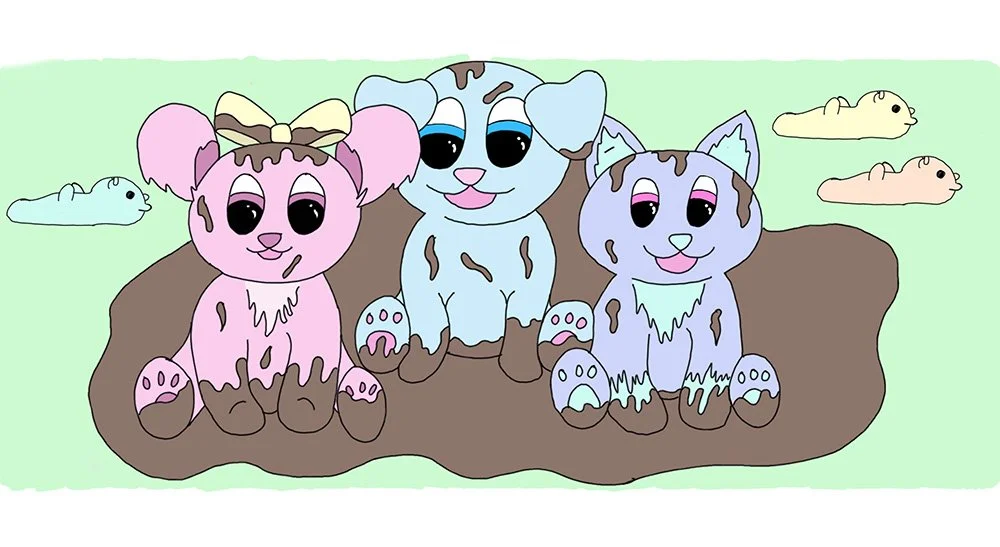
In my graphic novel “Arlo and Paw-sicle’s big adventure” the pups meet Dove, while they are getting to know each other they accidentally fall in a mud puddle. This was one of my favorite illustrations made for the novel.
-
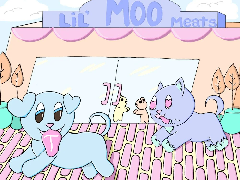
I was asked to create a character environment, I made ten different sketches using different points of view and scenes which you can see in my Character Work project. I chose this one to render because I think it showed Arlo and Paw-Sicles personality while completing the assignment.
-
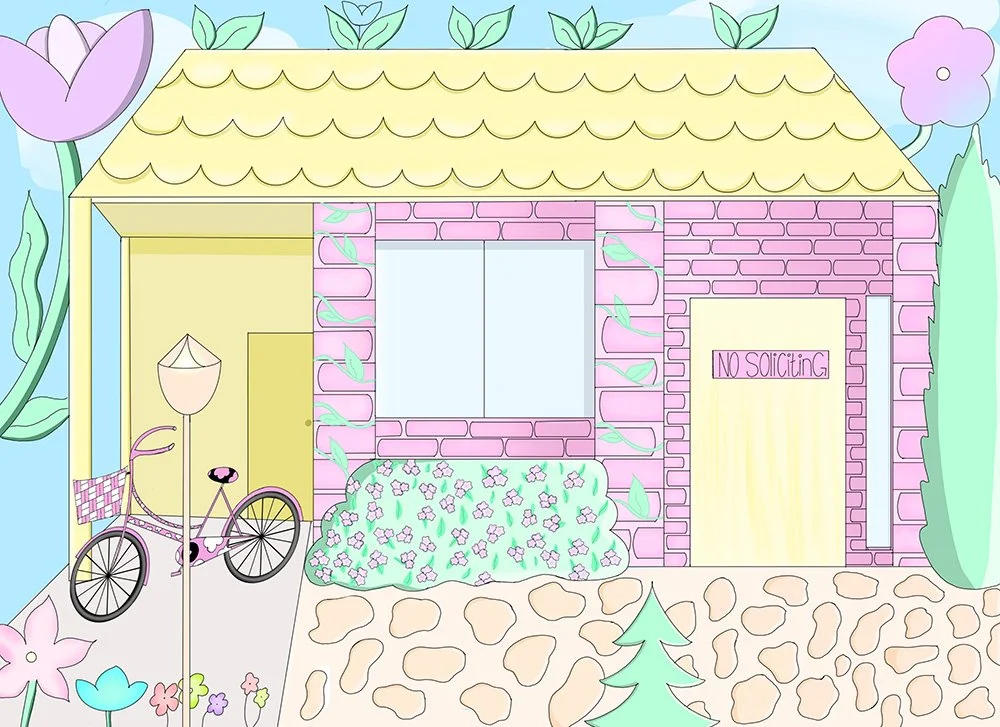
In Summer 2024 I was gifted Procreate! I also found out you can print a custom calendar at Walmart. I decided to make a custom calendar for my Mima. This is a drawing done for that calendar, which you can see in my Print Projects Section. This is an illustration of her house. While it is accurate almost to the brick it is a fantasized version that captures the love, whimsy, and fun I have with her.
-
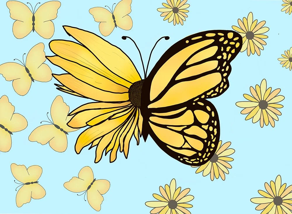
This piece was also created for the calendar made specifically for my Mima. I wanted a spring-like image so naturally I chose flowers and butterflies. I wanted it to show the symbiotic relationship between nature's flora and fauna, so I played with creating the shape of the butterfly using different types of flowers and ultimately preferred the sunflowers. To address the negative space I used lower opacity flowers and butterflies so it wasn’t empty or distracting.
-
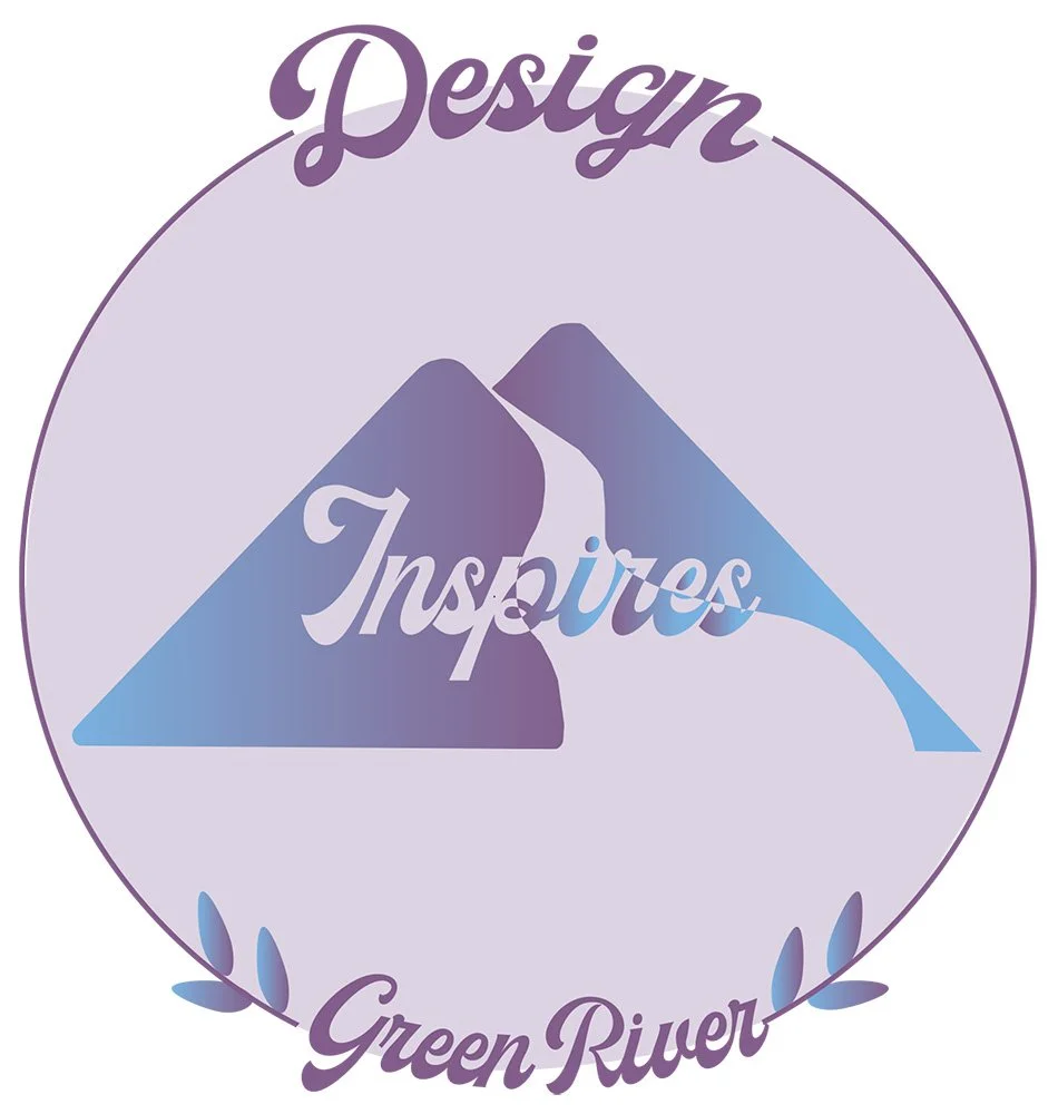
When I created this logo for the Green River design department I wanted it to feel inviting, fun, professional, and unique, because that is all the things that the department is to me.
-
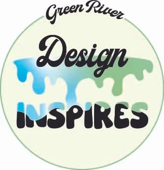
This is another logo I made for Green River, this one is a bit more fun less professional showing the fun the design students get to experience at Green River.
-
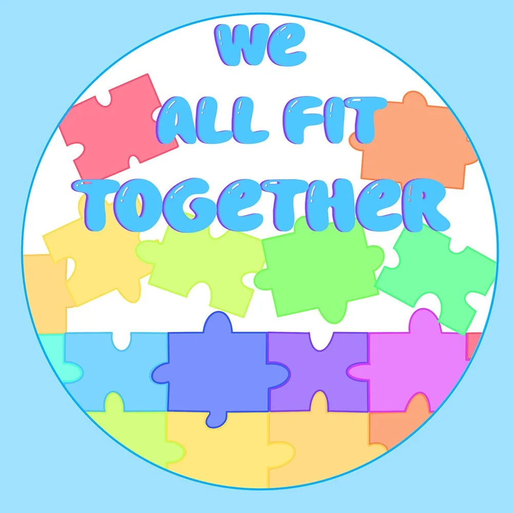
In one of my design classes we had a weekly mystery challenge, for this week it was to create a sticker for children. I decided to make it feel inclusive fitting all of the different colors and shapes together. I used big letters and bold colors to appeal to a younger demographic.
-
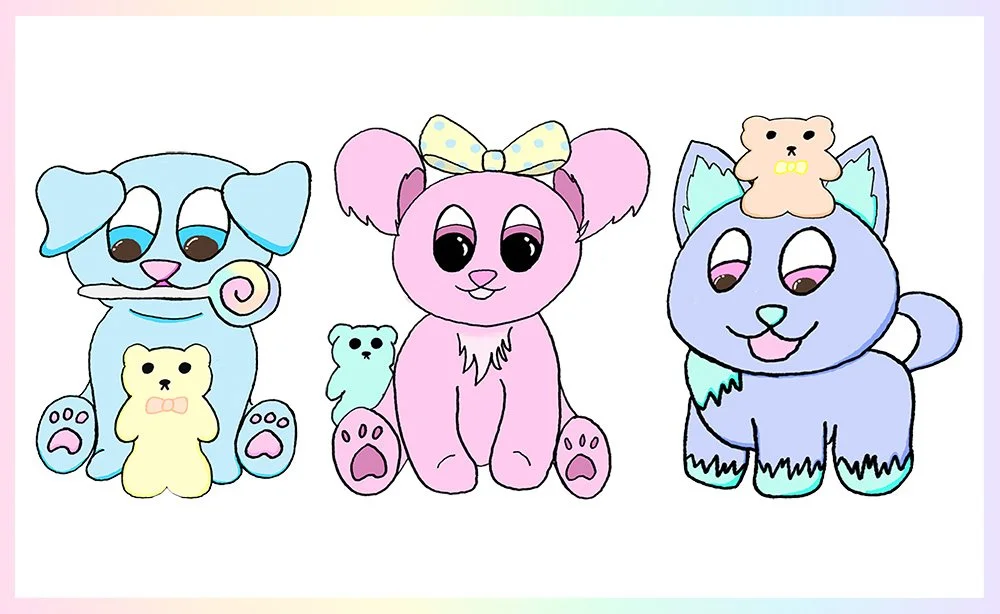
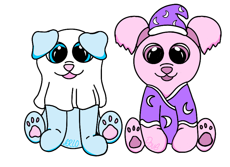
After doing a page of character sketches I fully developed these characters, Arlo, Dove, and Paw-Sicle, respectively. I also made them pets that I call the Gummy Pets! This illustration was just putting all that work together!
-
This was one of my first digital drawings. I loved experimenting with using colors, shading, gradients, just to make an image that would make people think one of two things: “she's crazy” or “that’s so pretty” like cartoons and childhood fantasies. This is my version of candy land, one of the many worlds I’ve created since I was a child.
-
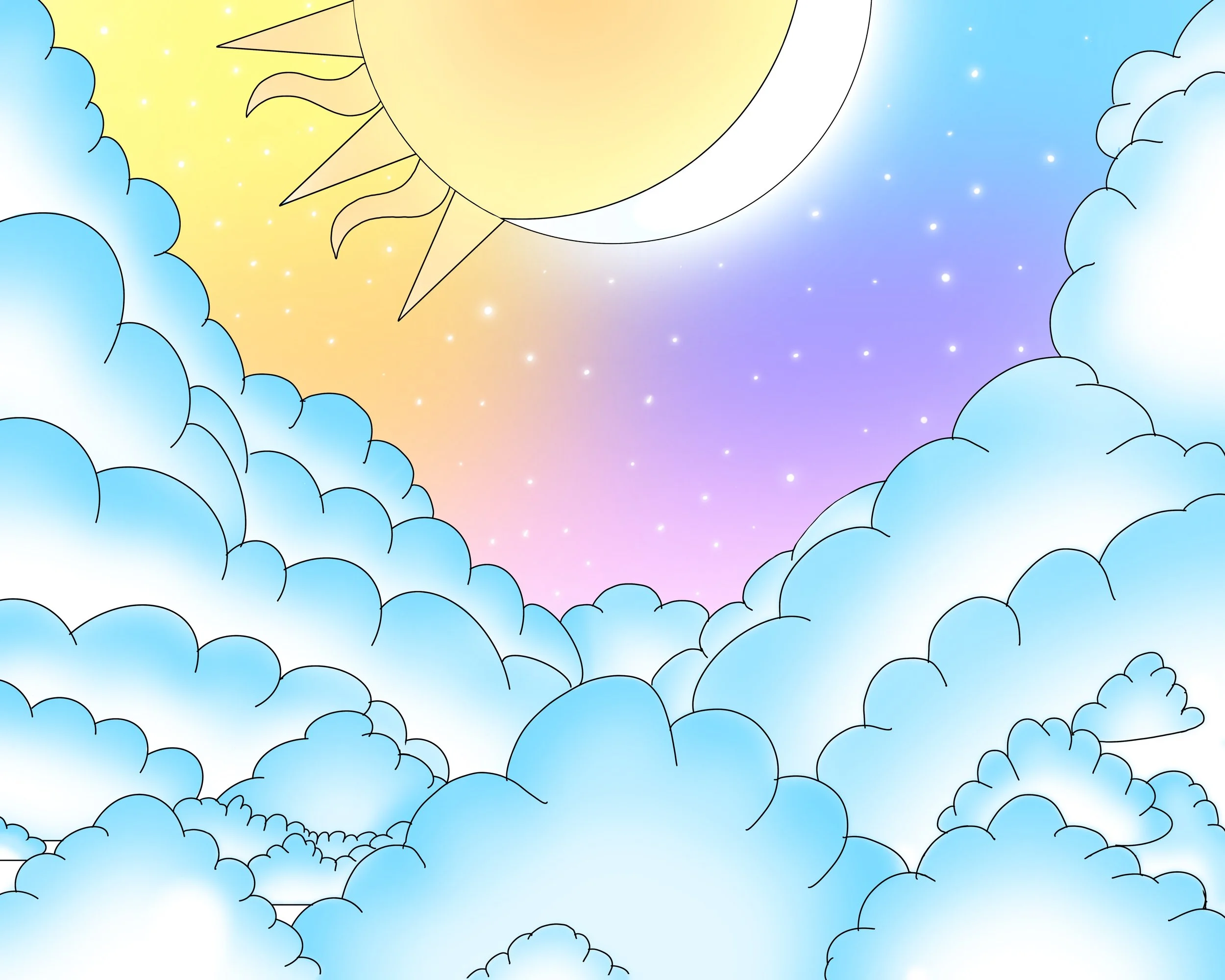
Last year, when I first started using procreate, my friend asked me to create a poster for her bedroom that was simple but a concept that would match her vibe. I decided to do the sun and moon, because she loves this theme, and fill it with clouds because that is her chosen name. I add pastels and stars in the background to coordinate with other pieces she already had in her bedroom. This was also the first piece I was paid to make.
-
On halloween I wanted to do an art project so I began sketching my characters on a wooden pumpkin, then added costumes so they could celebrate too! I ended up liking this design so much I rendered it digitally as well. Even though the costumes are simple I really like how well the ghost costume came out. You can tell at a glance it is Arlo and I managed to show movement in the sheet.
-
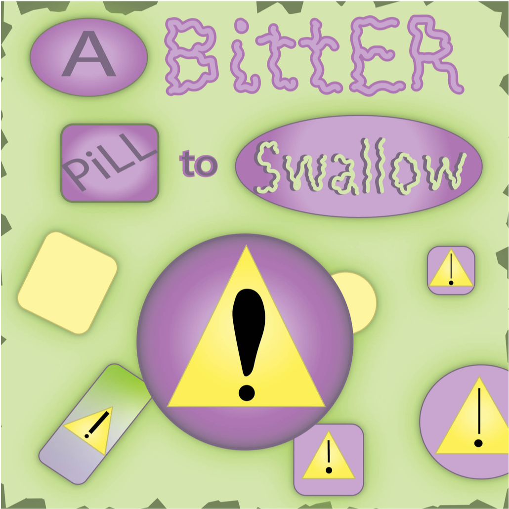
I was given an assignment, make a design using only 5 squares, 5 words, 5 lines, 5 triangles, 5 circles. I also had to choose a split complimentary, triadic, or analogous palette. The biggest challenge I had was making sure the sketch was interesting enough in all aspects. I used analogous, triadic and split complementary palettes in my 5 designs, I used different combinations so I could use a lot of the colors, especially the ones I don't use often. In some drawings | struggled to make it interesting enough and relied on the background. In a few of the sketches l used song lyrics as inspiration because I think music always has a lot to say. I ended up choosing the Bitter pill to swallow design because I really like the message it has. I used some depth by overlapping and kept the background interesting adding extra color behind the elements. I used a split complementary palette to emphasize the yellow hazard symbols against a purple. I used different scales, and a custom font for the words I think are important to emphasize as well.
-
I made this illustration based on cow spots and my general style as background for my computer and iPad. I added white highlights and some darker lined to give it depth.
-
I made this illustration based on cow spots and my general style as background for my computer and iPad. For this design I decided to go around all the edges in a slightly darker version of the interior colors to separate it from the background while keeping it soft and friendly. Because I used this design in the fall of 2025 I also added that to the top to give it a bit more interest.